Idea: Candyland SimulatorNov-24-10, 10:51 pm by Hanford | Read full postFile under: fun
WARNING TO PARENTS: this post contains adult language not suitable for little kids.
Enter my latest invention: the Candyland Simulator. The game Candyland is a real drag to play with a 5 year old. It's boring as hell. And kids that age tend to whine when they don't win, or when they draw a card that sends them back to the beginning. So the next time a 5 year old asks you to play, say "sure! Let's use the Candyland simulator!" Candyland does not require the player to make any decisions in the game. It is completely deterministic based on how the cards are shuffled beforehand. You just draw a card and follow the instructions. No decisions to make. Because of this, you can calculate the winner of the game simply by examining the cards, without actually playing it. The Candyland simulator does this for you. You just click "play Candyland" and the game immediately tells you who won. You can now play Candyland in less the a second. Shit, you can play 60 games in less time than it takes to take a dump. Your move, Milton Bradley. Fort Wilderness Cabins at Walt Disney WorldOct-15-10, 5:53 pm by Hanford | Read full postI recently got back from Walt Disney World, and this time I stayed in the Fort Wilderness cabins. Here's some photos, down and dirty. Here's the "Outpost", AKA the front desk where you check in:
Here's the cabin I was in. It's free standing, surrounded by pine trees, and other cabins. It really didn't feel like Florida at all. I felt like I was in the mountains (something Florida certainly does not have, if you've never been there.)
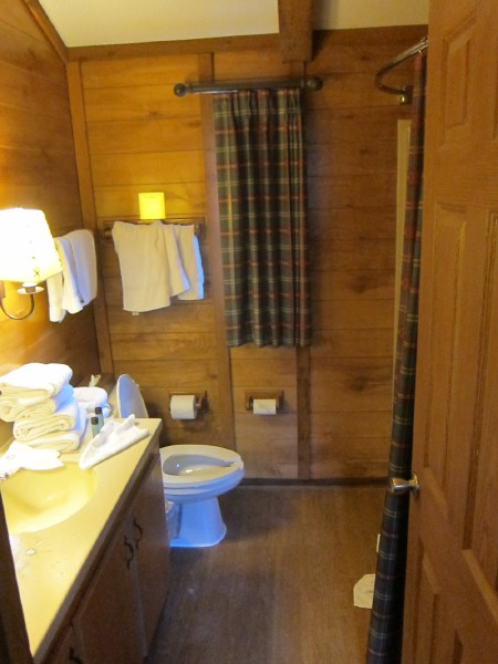
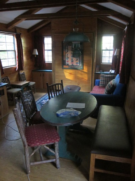
Interior shots (sorry for the mess, this was before housekeeping came):
That's a twin(?) bed on the left, up against a wall, and a bunk bed. This room has it's own private door out to the patio. Although it has no key and automatically locks, so you can leave without disturbing anyone in the living room, but you won't be able to get back in without going through the main door.
This is the living room. There's a Murphy bed in that wall between the two windows. The TV is off to the left.
Here's where the Hoop-Dee-Doo Revue is performed:
Here's a weird mosaic in the bathrooms at Pioneer Hall. The cowboys all appear to be scratching themselves. Fleas?
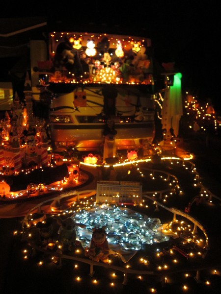
Fort Wilderness is mostly an RV park. As it gets closer to Halloween, RVers park and set up elaborate Halloween displays. I'm not sure if this happens in all RV parks or just at Fort Wilderness, but it's really cool and involved.
And while this is not in Fort Wilderness proper, here's Wilson's Cave Inn, from Davey Crockett and the River Pirates (although it was based on the real life Cave-In-Rock):
Fallingwater in MinecraftOct-2-10, 8:41 pm by Hanford | Read full postFile under: fun, Video games I found this in Reddit's Minecraft subreddit. Pretty sweet. I wish I had thought of doing this.
There's two pages of pics on Imgur. Thoughts on the Nintendo 3DSSep-30-10, 6:37 pm by Hanford | Read full postFile under: fun, tech, Video games
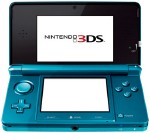
The Nintendo 3DS is coming. It's a portable gaming system like the DS, but it features a 3D camera and an autostereoscopic screen. (meaning you can see 3D without needing special glasses)
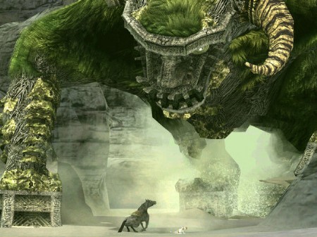
Thoughts on Shadow of the ColossusThe first post in a series on games I didn't likeSep-28-10, 6:55 pm by Hanford | Read full postFile under: fun, tech, game design, Video games, Games I didnt like In talking with a lot of fellow gamers over the years, it turns out there's a ton of great games that for whatever reason I didn't like. I'm calling them "Great Games" because everyone loved them, deservedly. Except me. No, seriously. This is not about bad games. It's about truly great games that didn't hold my attention. Hopefully in reading this you'll discover some insights about game design. I know I did, when I wrote it. Shadow Of the ColossusThis particular post came in response to a Buzz my friend did for this article. I wrote a reply that I'm reposting here via Games I didn't like.
I loved ICO and played it to the end. Colossus on the other hand I only played for one session and never booted again. I killed 3 Colossus in that first session, although I remember it being frustrating as hell ... I just kept falling off the damn thing. To the point where I found my hand hurting -- I was instinctively gripping the controller as hard as I could in order to keep from falling. I remember being infuriated. After the 3rd beast fell, I thought "ok, I think I know what this is all about now." and took a break.I just never turned the game back on. I never felt compelled to see what the subsequent Colossus looked like or what variations on the kill method was. Especially if it meant my hand aching again. I don't think the game gave me enough positive feedback in that first session. I don't think there was anything enticing me to come back and see what was going to be different. It didn't appear as though anything would be different. I know the game is considered breathtaking and a work of art. I thought it was beautiful and the beasts were truly epic. I know it defied the conventions of games at the time (and even most games today) by making it basically just boss battles and nothing in between except for the loneliness of travel. I ejoyed those aspects of it. I just didn't enjoy the act of killing the bosses themsevles. It wasn't gratifying, it was just tedious. I'd like to try it again sometime, especially with the new graphics. By the time I got to play it, PS2 graphics were already old and chunky looking. perhaps I needed break from it. The new Google Docs: going in the wrong directionSep-16-10, 8:08 pm by Hanford | Read full postFile under: tech, User Interface, UI design, Google I tried to use the new version of Google Docs today. It's a big step back in usability. Why? Well first, whether you get the new Google Docs or the old one is based on the Document you created. All new documents use the new UI, older documents will continue to use the old UI. So right there you've got a pretty inconsistent user experience. Secondly, Google changed up some keyboard shortcuts between the old Google Docs and the new one. What did they change? They changed the shortcuts for setting Heading styles. It used to be Ctrl 1 - 8 for heading formats 1 though 8, and 0 for normal. The new keyboard equivs are ctrl+alt plus the numbers. Why add the extra key? Ctrl + Alt on laptops is a signifcantly harder combo to access. Alt is quite often crammed onto laptop keyboards since it's not used as frequently. Thirdly, and perhaps most importantly: the new keyboard combo seems to be broken quite often. I tried it several times, and it simply didn't work. And when it did, it took seconds ... literally seconds for the formatting to show up. Why this is importantThis is important because anyone who writes documents regularly is going to be a pro user -- someone who is going to take the time to learn the shortcuts so that outlining and formatting isn't a clunky mouse operation. Keyboard shortcuts for formatting is important for anyone writing a document more than a few pages. Right now, the new Google Documents is a step back for serious authors. At least Google lets me go back to the old version. But Google, come on, I expect more from you than this. Why I love my Droid IncredibleAnd why I think it's a better phone than my iPhoneSep-5-10, 9:51 pm by Hanford | Read full post
But that didn't happen. NOTE: Some of the the features I talk about here may only apply to HTC phones, or to Verzion-based phones. Main Reasons why I love my Droid
Can you do this stuff on the iPhone? Not exactly the same way. You need to [1] find 3rd party apps that integrate with the services you like (and pay for them if they're not free), [2] set those apps up with your facebook, flickr, and twitter credentials, doing this again and again for every app, and [3] remember to use these new apps instead of Apple's default apps. With my Droid, I set it up with facebook, twitter, and flickr as part of the welcome-to-droid setup, and sharing was built into all the apps from the very first second I started using the phone. Contact merging with Facebook & Twitter. Right out of the box. This is a bit more of an extension of the above. The Incredible's default contact list matches up your facebook and twitter friends and assigns photos to the contacts from Facebook. No need for a 3rd party app. It pulls status updates from these sites and puts them right in the contacts list and it other relevant places. I was shocked to see within minutes of firing up my Incredible for the first time that not only did it have all my contacts, but pictures for them. And status updates. Plus the Incredible comes with a widget that automatically generates a merged friendstream of your facebook, twitter, and flickr friends. No exta setup or downloading needed. Widgets. Yes, they can ugly-up your home screen, but I use them correctly and it became obvious to me why Apple's approach of making my home screen nothing but a grid of app launchers is near-sighted. Put a list of your top contacts right on your home screen. Put a friendstream of twitter there. There's no need to launch an app. But being able to see today's appointments right on my home screen without having to open the calendar? Priceless. It actually makes the calendar useful now. I never used my iphone calendar because I'd forget to check it, and it became a negative feedback loop. With widgets I never have to launch an app for my most common functions. they're all there in the home screen already. If I read about something in my home town that I want to check out, I'll add it to my custom map. When checking my map on my phone, I've noticed I'm close by to things I want to see. Combine that with being able to speak the location I want to look up, and this maps just blows the iPhone map app out of the water. Other things I like about my Droid IncredibleThese are all things that I truly find more useful on Droid, not just a mindless bulleted list.
What I miss about my iPhone
But the other features I listed just blow the iPhone out of the water so much so that I can easily give up those three other bullet points. SummaryI didn't know what to expect when switching from iPhone. I was kinda scared that I'd wish I'd stayed with Apple. But I am so happy in so many ways that i switched to Android. I was never a huge Apple Fanboy (anyone who reads my blog knows this) but I have quite accidentally found myself in fanboy love with my Droid. I am so happy I made the switch and at this point it would take Apple some serious next-gen killer feature, in addition to some good old fashioned catching up, for me to want to switch back.
Note: I worked at Google on Google TV -- before it was Android-based -- but I personally don't feel any bias I may have towards Google or Android is a factor here in this review. "Soon Obsolete" signJul-27-10, 7:09 pm by Hanford | Read full postFile under: fun Found on a fence in the Mission District: 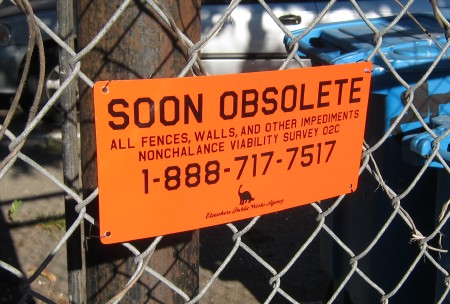 Happy Birthday Amiga!The Amiga celebrates its 25th birthdayJul-23-10, 3:09 pm by Hanford | Read full postFile under: tech, DVR
How I rate music with iTunesOr: Why my ratings system is so screwed upJul-10-10, 12:05 pm by Hanford | Read full postFile under: tech, UI design, Apple, Bad User Interface, Mp3 Any friend who share musical tastes with me (and there aren't many!) knows I have a really weird rating system for my music. One that needs to be explained. Here's what it is: 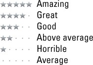
So it looks pretty standard until you get to 1 star vs 0 stars. They're reversed. When I first tell people that's my system they think I'm insane. But ... it is Apple who is insane. Why my ratings system works this wayI do a lot of random/shuffled playback. I don't like spending time managing music, building playlists, and searching my catalog. I just really want to listen to it with as little clicks as possible, and shuffle and smart playlists let me do that. But iTunes has a problem. when I imported my music library, all my songs were set to 0 stars with no apparent way to change them other than rating song one at a time. One at a time. Now, on top of this, I have a lot of music that I don't want to hear on regularly, if at all. They're novelty songs that are fun on rare occasions. Or they're themed (read: Xmas) music that I don't want randomly popping up throughout the year. And sometimes they're just songs I hate and never want to hear again*. I'd like to keep these songs from every being picked randomly by a smart playlist. Ideally, these songs would be rated the lowest in a scale of zero to five, and I could create a smart playlist that says "play songs rated 1 through 5" and I'd get everything but the ones I've tagged with zero. But, in the real world of iTunes, this means I'm back to square one: stuck with rating every single song which is NOT a zero individually. I'd have to rate hundreds of songs -- one at a time -- just to get a little bit of variety in a random shuffle. It would take forever to get a sizable amount of songs rated that would provide hours of variation. My solutionI thought this was all very nearsighted of Apple.All I wanted was to be able to play my library on random and rate the occasional bad song as "never play again", and rate the occasional Good, Great, and Awesome songs as such. Then I realized I could do this with a smart playlist that looks like this: 
This smart playlist will play songs rated 0, 2, 3, 4, 5. Everything but one star. if I treat zero stars as average it means that my entire collection is by-default rated as an average tune! I don't need to do a thing to the vast majority of my music. rating a song one star is essentially tagging it as "never, ever be chosen automatically again." This means that in an average hour of listening to iTunes, I switch to it to rate a song perhaps 4 times an hour. Of course, this number drops as I get more and more of my library rated. Contrast this with zero stars meaning "never play automatically": it would mean that nearly every song (3 to 4 minutes) I'd have to hop back into iTunes to rate the song as "Average" or above. ** SummaryI was originally going to write up a whole User Experience summary here, bringing up all the design rules Apple missed with this one. But, it should be obvious to you by now: Apple severely cripples the rating experience without allowing batch rating. I'm now stuck with this hack of a system.At least it works. *** Footnotes* Yeah, I could delete them, but there does not seem to be an easy way to do this in iTunes. And it still wouldn't take care of the other cases.** Not to mention the fact that this wouldn't actually work. If zero stars means "never play again", and by default all my music is rated zero stars, I'd be stuck with using a play-anything playlist that would continue to randomly serve up songs I've played and left at zero. The only solution would be a smart playlist that allows zero-star songs a few trial plays before rejecting them: 
But that's less than ideal: you have to listen to bad songs a few times before iTunes stops playing them, and you have to be incredibly deligent at rating your entire collection whenever they play or risk an accidentally unrated song drop off the playcount threshhold. Changing the threshold trades one disadvantage off for the other. *** For a few versions of iTunes the smart playlist editor UI was broken and it was impossible to create any smart playlist that chose music based around star rating. Luckily I had created my solution before the bug showed up, and it didn't keep my original playlists from operating. It's fixed again in the version I'm using. **** My "I hold Apple -- as an industry leader -- to a higher standard" rant applies here. |
|
I make things. From consumer electronics, to video games, to theme park attractions. Perhaps I can make things for you! Check out my portfolio. When I'm not making things for other people, I'm usually experimenting.
Follow me on Twitter. Message me on Facebook. Email me using my contact form.
|
|









 Why do I love my Droid Incredible over the iPhone? It has very little to do with the network. By the way, I've been a loyal iPhone user since the original, and loved it up until very recently. Even when I switched to Android, I was worried about what the experience would be like. I was worried I'd hate Android.

 According to Engadget,
 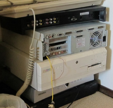 That's an Amiga 3000, upside down and backwards, in the middle. Below it is the Amiga 4000, and some Amiga keyboards at the very top. Incidentally, The Oreo cookies to the Amiga's cream in the photo are two

